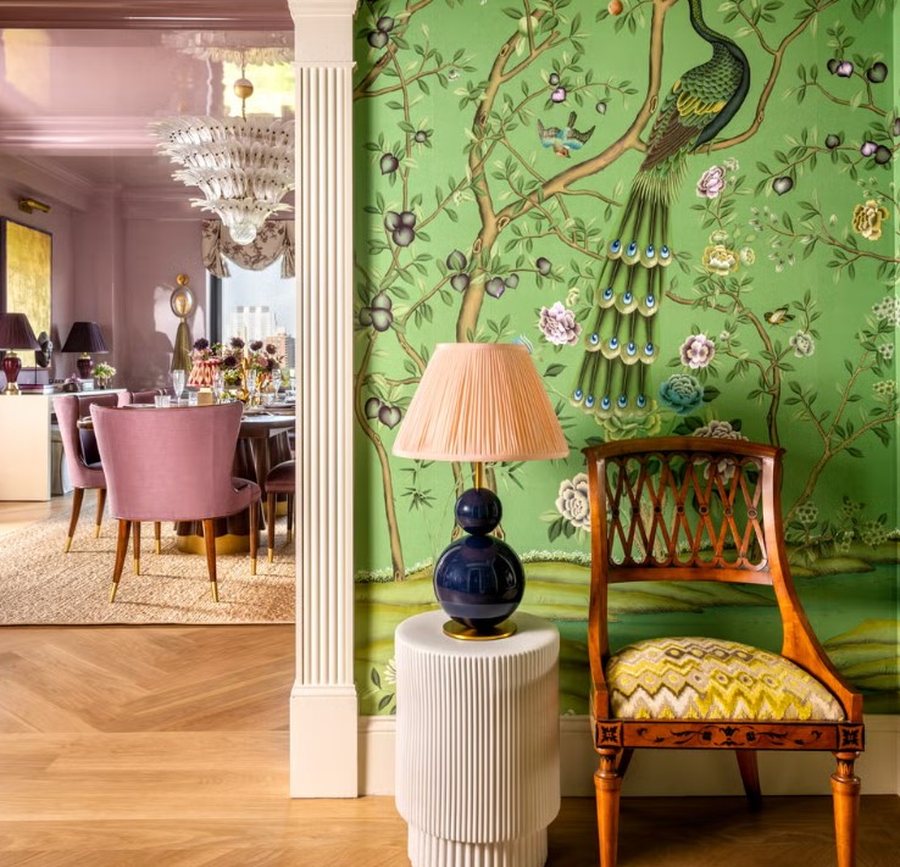
It’s no secret that shades of green have been making headlines in the design world. Behr named “Hidden Gem,” a deep jade-like green, its color of the year for 2026, while Valspar chose “Warm Eucalyptus,” a softer green. More than 18,000 videos have been created on TikTok with the hashtag #greenhome, where designers and content creators share ideas for decorating with the color. But two specific shades of green are dominating the discussion: teal and pistachio .
Teal: a deep blue-green color (like dark blue mixed with green, a bit like the color of the deep sea).
Pistachio: a light, soft green shade, like the color of pistachios.
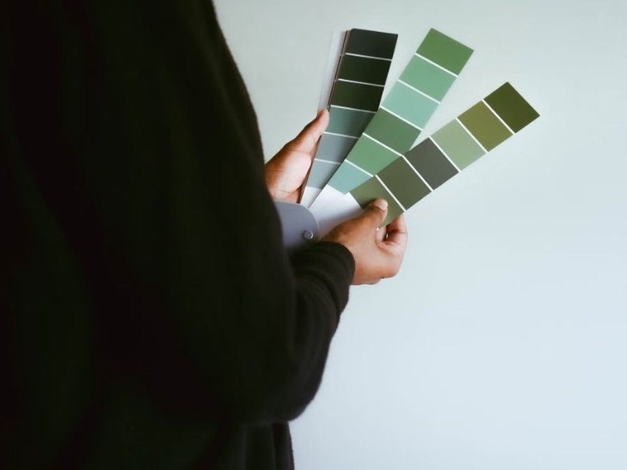
“We’re seeing a collective breather,” says designer and author Corey Damen Jenkins. “After years of neutral-filled spaces, people are looking for colors that feel vibrant and cheerful, without being loud or aggressive. These two colors have a calming feel, they invite you in, they don’t ‘shout’ at you. It’s about how people want to feel in their homes today.”
Designer Austin Frost also supports this trend, noting that soft greens like pistachio will continue to be fashionable, along with light blues, soft pinks and creamy whites. According to him, the style has a coastal influence, but is light and fresh, not heavy.
How to use these two colors at home
Choosing the right room. Teal is recommended for bathrooms or bedrooms with private bathrooms because it creates a spa-like feel. This color is naturally associated with water and gives a feeling of purity and freshness.
Pistachio is ideal for rooms with natural light or living rooms. It can be used on walls, curtains or bedding for a light atmosphere. It is also suitable for hallways, entrances or home offices, as it creates a creative and calm energy without tiring the eye.
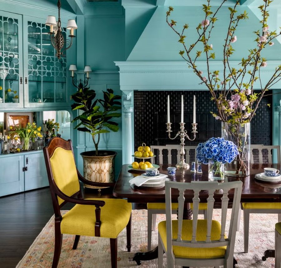
Use as an accent color. Pistachio can be used on cabinets, kitchen countertops, or decorative details, especially when combined with wood, cream colors, or gold elements. Teal brings depth to a space when used on walls, sofas, or rugs.
Experiment with small details. For those who don't want big changes, it's recommended to start with pillows, paintings or rugs in these colors on a neutral background. This allows for change without a big commitment.
Creating contrast. Deeper shades of teal create more intimate and elegant environments, especially in dining rooms or reception areas. To avoid a cold feeling, warm lighting and metallic elements such as gold or copper are recommended.
For pistachio, combinations with cool white, warm beige, soft pink and gold are recommended. Teal goes well with warm orange, butter yellow and brown leather.
Using natural materials. Materials like linen, straw, warm wood, and natural textures help balance these colors and make the space more harmonious.
-
-

8 things you should always throw away before guests come home
April 24, 1:32 PM -

"Escape": The new trend that transforms our homes into paradises
April 19, 15:48 -
If you want a house that smells good, get this flower
March 25, 2:07 PM -